Why did we rebrand Molivery?
“Our brand doesn’t characterize who we are today and what we do.”
That was the point where we had reached a year ago. We needed to think forward and change our brand.
In order to understand today’s situation, it is necessary to go back 5 years to the beginning of Molivery (originally MoliveryMedia – yes, we also changed the name of the brand during the rebranding).
Let’s start from the beginning
MoliveryMedia digital marketing agency was created on January 23, 2017. We were quite enthusiastic about it. No wonder why. We were starting a business when we were in our early 20’s. Like other things, you look at this project through pink glasses.
It soon became clear to us that digital marketing was growing into something bigger. We had a feeling that this will become a service that will make or break companies.
As the demand for our services increased we found ourselves quite deep into digital marketing. As there was no previous experience, we immediately started testing on our own and practising what we had learned.
At that time, digital marketing in our agency consisted of organizing lottery games. You know, the ones where you need to like the post and comment on it. Every other Estonian agency worked like that back then. It’s good that we got out of this vicious circle quickly.
Continuous development
The Molivery team has always been curious and proactive. It’s in our DNA to this day.
- Taavi Altpuu, CEO of Molivery

Back to today
5 years ago our first client was a small Asian restaurant in the centre of Tartu. Today, we are a strategic digital marketing partner for Estonian medium-sized companies that have a clear and understandable product. They all have the same goal – to grow both in domestic and foreign markets.
Our approach to digital marketing has also changed drastically. Along with this, the business environment, people’s consumption habits, expectations and assumptions of the digital marketing partner and strategies on how to implement digital marketing have changed.
All of this has made consumers take a different look at marketing. If in 2017 the company was the one that dictated how the customer should move in the decision-making process, then today all the activities are dictated by the customer. Your client has full control over the decision-making process. And so it should be!
Marketing must adapt to this. Create demand for end products in end-users so that the customer comes voluntarily to your shop to do business with you.
How to do it? Through customer-centric digital marketing.
With all this in mind, our old brand didn’t fit into this formula – it just spoke such a different language from such a different era.
What were the existing bottlenecks?
When looking for a strategic marketing partner, you want confirmation that your business is securely in the care of experts.
To confirm your decision-making you normally follow these steps:
- You ask for recommendations from your colleagues;
- You examine the successful projects that the potential marketing partner has completed in the past;
- You analyze whether they “walk the talk” or not.
Let’s be honest. As a digital marketing agency, you are a reflection of your customers. Our own brand and marketing activities did not characterize it. We still had an image that serves only small businesses. But that wasn’t the case anymore.
The changing digital world needs a role model that can give customers a way to do digital marketing. It was necessary to create clarity about our DNA so that we could stand out in the fierce competition and focus on customers who care about customer-centric digital marketing.
Service design
Based on the above, it can already be assumed that service design is needed in such a situation. Fun fact – we just didn’t know it yet.
Fortunately, we received this recommendation from the Estonian top-notch service design agency Brand Manual, which was ready to deal with the rebranding of Molivery if we start reviewing the service concept instead of creating an existing identity and website.
The Brand Manual team helped us unravel the services and value propositions we offer – they listened to us and interviewed our customers, giving feedback on what is good, what is bad, and where there are our hidden strengths and opportunities that we could not even notice.
Background research and mapping customer needs showed what customers consider important to us:
- Strategic – specific plan, systematicness and clarity in the activities on the basis of which we are seen as a strategic partner.
- Sniper work – preliminary work and a clear understanding of our client’s client help us to direct resources in the right direction.
- Proactivity – based on statistics and understanding the customer’s business, we are able to offer suitable solutions to improve marketing activities.
- Change – we enable external partner clients to make big and quick changes without spending time and money assembling an in-house team.
- Focus – we help save time so that the company can focus on developing its core business and managing customer relationships. Marketing is left to experts.
- Numbers – we find the specific metrics we need to measure the effectiveness of our collaboration, helping to measure the value of every euro invested in digital marketing.
During that we learned of some of the bottlenecks that hampered our development and growth:
- Too wide range of services – if you try to be good at everything, you are not the best. So we headed for 5 basic services.
- Clarity of communication – there are many everyday parties, channels and information, which is why we implemented the necessary software and processes to optimize the exchange of information with customers and partners.
- Validation of interoperability – we realized that we are much more efficient when we work with clients who get exactly what we are doing and also wants to grow together with us.
Hallelujah! I’m glad that we took outside advice because otherwise we would have put a new coat of paint on the car, changed the wheels, and poured rocket fuel into the tank. In the short term, it would certainly have had an effect, but we’re in it for the long haul.
The visual identity
Oh, don’t get me started…
The visual identity was the reason we originally embarked on rebranding. We knew that our identity, created in 2017, was over and underdone by now.
When we started, we had a small team and a workflow, so there was no time or need to think in detail about what our brand might look like, where and how we would use our identity, what impression our website might have on a potential customer or new employee. etc.
Let’s be honest. We didn’t even think strategically at the time.
By now, we had already realized that when rebranding, it has to have a solid touch, which would arouse more interest in people and force them to stop for a while diving into the fast news flow.
We have already written about new operating principles and offering greater value to customers. Now it’s time to move on to the more visible part of our brand’s “iceberg”.
01Molivery is our good old new name
Yes. The new name is actually half of our old name. The change was essential because:
- The name was too long for people to remember;
- There were problems writing the name. Do you write MoliveryMedia together or separately? Is Media in English or Estonian? Is there an “i” or “y” at the end of Molivery? Uppercase or lowercase letters?
As recommended by the Brand Manual, we simply stick to “Molivery”, which is simpler, maintains consistency and is easier to remember. We also registered the corresponding .com address for a nice touch, which is a real deficit today!
Molivery is a fictional word – it had no meaning in 2017. During the re-branding, we came to the conclusion that there is no need to invent a new and airy name because the existing one fits very well with the promise of our brand, which is “We plan to deliver”. Molivery now equals “more delivery” or Mo-livery. Less is more! More or less. After all, a name is just a name, and much more important is that we do our job well.
02The logo
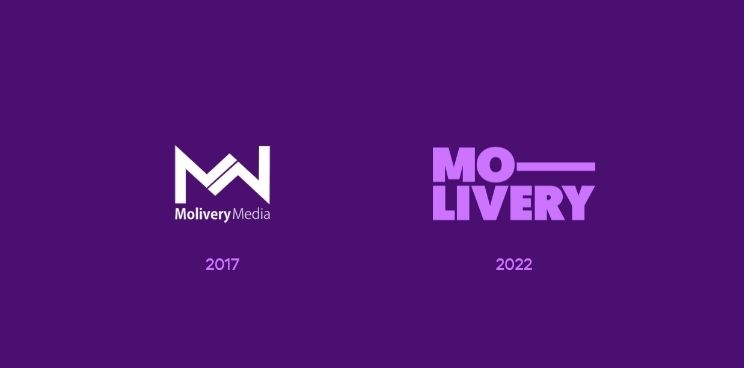
The logo, which was quickly made on the go, carried us for 5 years. Thinking back to that time, we sat behind the table for 30 minutes and thought about how to combine the two m’s that occurred in our brand name (MoliveryMedia). We drew a design on A4, Photoshopped it, and there it was. The logo had no clear meaning at the time – it was created on the basis of need.
For the new logo, we assumed that it must:
- be a complete system, not just one pleasant sign;
- stand out;
- look vigorous, concrete and minimalist;
- be usable in both digital and the real world.
03Colours
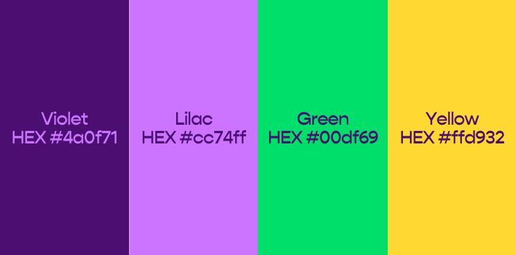
Let’s go berserk!
If you look at the social media (if any) and websites of local and cross-border competitors, the overall impression of all the agencies is quite sterile. No one dared to stand out with their visual identity. Inventive and expected colour solutions with Facebook-blue and Bordeaux-red tonality.
Our plan was to stand out. Wake up the Goliath and take him down.
So there was nothing left but to go to the extreme.
We gave the Brand Manual freedom to choose the new brand colours. The only input was that we had to stand out with colours. That’s it!
The end result was… wowzers! Bold use of paint. Distinctive. But at the same time professional and, if necessary, corporate. It all depends on the context in which we use these colours.
04Illustrations

Emojis bring out emotions on social media.
Why not use them in our brand?
And I’m glad our new brand consists of emojis-inspired illustrations because it helps bring depth to the brand.
We are used to seeing emojis in texts, but here we bring them to life with both static and dynamic visuals.
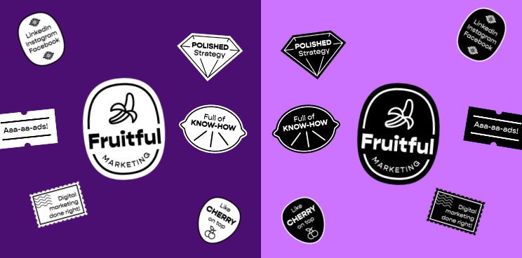
05Stickers
When the Brand Manual came up with the idea of stickers, we were immediately sold. With stickers, we can highlight messages that are important to us.
Spice up our visuals a bit – blog posts, social media posts, podcast audio sticks, and more. It has also opened up a wider range of options for how to acquire potential customer mindshare and keep your attention in your posts.
If we constantly add more stickers, then from the point of view of a customer who is already aware of us, there will be a joy of recognition.
However, using these stickers creates a subconscious joy of recognition as well – when you see banana labels next to a fruit slice in a grocery store – what do you remember? Fruitful marketing.
06Team photos
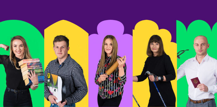
Molivery is in a B2B business. This does not mean that we should be sterile and completely corporate. On the contrary. After all, companies don’t work with companies, but still with real people.
So we took the liberty of being freer with the pictures of our team – bringing personality to them, just as each of us really stands out as a person. That is why we have used elements that characterize our people in our photos.
Our new website
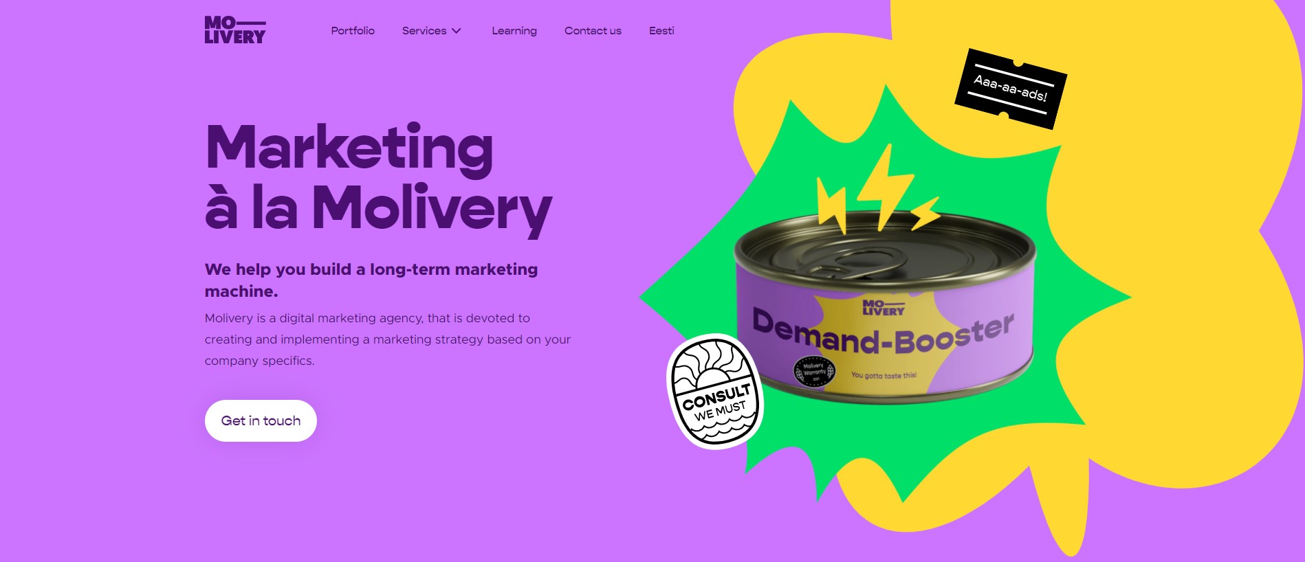
The new website brings together Molivery’s inner beliefs and renewed nature in one place.
The end result was refreshing and easy.
Our goal is not to sell through the website, but to create demand:
- highlight the success stories of our customers;
- inspire potential customers to embark on a journey towards customer-centric digital marketing;
- introduce the Molivery team and beliefs;
- share our marketing knowledge with the wider public.
And this is just the beginning! A new beginning in a five-year journey.